Eric Gill Typefaces and Fonts


While apprenticed to an architect in London, Gill became aware of the world of calligraphy, attending classes given by Edward Johnston.

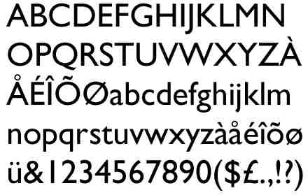
Of all the typefaces that he designed, Gill Sans is his most famous; it is a clear modern type and became the letter of choice of the railways, appearing on signs, engine plates, and timetables.

"The shapes of letters do not derive their beauty from any sensual or sentimental reminiscences. No one can say that the O's roundness appeals to us only because it is like that of an apple or of a girl's breast or of the full moon. Letters are things, not pictures of things."

In typography, a typeface (also known as font family) is a set of characters that share common design features.


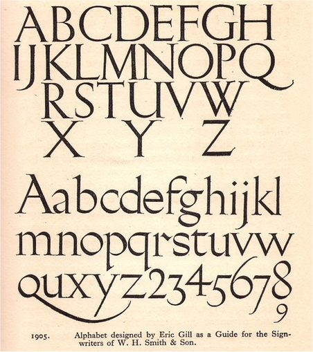
Eric Gill - typeface or alphabet designed for W H Smith & Sons shops, c1925
Eric Gill designed many fine typefaces including the well-known "Gill Sans". One of his others, that can still on rare occassions be seen, was the corporate typeface used by W H Smith & Sons. W H Smith's, the famous UK based newsagents and booksellers, had a very strong identity for its shops and advertising.
This typeface, with strong links to the pen lettering that Gill had studied with Edward Johnston, was to 'guide' the company's signwriters - and it appeared on shop and kiosk fascias, signs and vehicles

Fonts associated with by Eric Gill:

Aries
Gill Facia
Gill Facia Display
Gill Floriated Capitals
Gill Sans
Gill Sans Bold
Gill Sans Bold Condensed
Gill Sans Condensed
Gill Sans Display Bold
Gill Sans Extra Condensed Bold
Gill Sans Infant
Gill Sans Infant Bold
Gill Sans Light Shadowed
Gill Sans Light Shadowed MT
Gill Sans Shadowed
Gill Sans Ultra Bold
Gill Sans Ultra Bold Condensed
Humanist 521
Joanna
Joanna Extra Bold
Joanna Solotype
Jubilee
Lapidary 333
Perpetua

Please see
identifont for details
 
Return to first page
Next page